


You’ve probably noticed it before. Two small businesses sell nearly the same product, but one feels polished and trustworthy while the other feels slightly off. More often than not, the difference comes down to one thing: the core design principles every small business owner should know, applied (or ignored) across the brand.
In addition, you don’t need a designer or a huge budget to fix this. You only need to understand a handful of core ideas and use them consistently. Whether you’re tweaking a logo, designing a flyer, or planning new packaging, these design principles shape how customers see your brand long before they read a single word.
Let’s break down what they are and how to start applying them today.
Why Design Principles Matter More Than You Might Think
We live in a visual-first world. Before someone reads your Instagram caption or hears your pitch, they’ve already judged your brand by how it looks.
Consider the numbers. Research from MIT shows that 90% of information sent to the brain is visual. Meanwhile, Google’s research found that it takes only 50 milliseconds for users to form an opinion about your website. (Source: Google UX research, via Behaviour & Information Technology)
As a result, throwing together a Canva template at the last minute won’t cut it anymore. However, when you apply solid design principles, your brand starts looking intentional and trustworthy, even on a tight budget.
Core Design Principles Every Small Business Owner Should Know
In branding and marketing, design principles work as the invisible glue holding your visuals together. Below are the essentials worth memorizing.
Contrast: Make Key Elements Pop

Contrast is about difference: light vs. dark, large vs. small, bold vs. subtle. As a result, it pulls the eye toward what matters most, like your logo or call-to-action button.
How to use it:
- Pair light backgrounds with dark text, or the reverse, for easy reading.
- Highlight important details using bold fonts or accent colors.
- Check that your text passes basic accessibility standards.
Read this: Small Business Win: Implementing Design Principle Contrast
Alignment: Create Clean, Professional Layouts
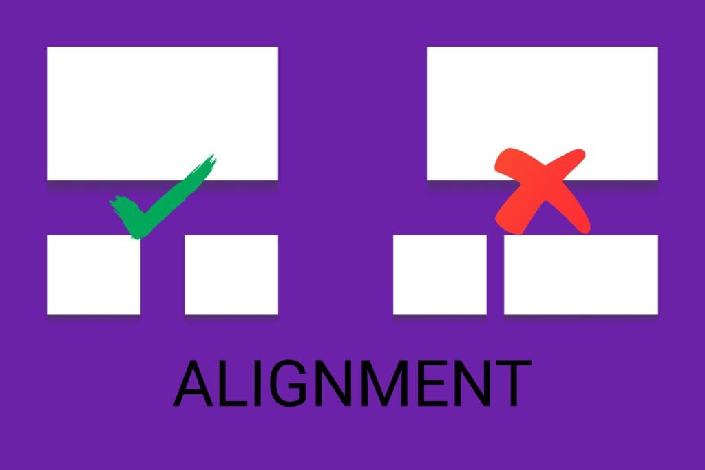
Alignment makes every visual element feel connected. On the other hand, poor alignment makes designs look messy and unprofessional.
How to use it:
- Use grids or guides in tools like Canva or Adobe XD.
- Pick one alignment (left, right, or center) and stick with it.
- Apply even spacing so the eye moves smoothly across the layout.
Read this: Design Principle Alignment: Elevate Your Small Business Instantly
Hierarchy: Guide the Viewer’s Attention
Visual hierarchy leads readers through your content in the right order, from headline to detail to action.
How to use it:
- Use larger fonts for headlines, medium for subheadings, smaller for body text.
- Contrast colors and spacing to highlight what’s most important.
- Place key information, like a promotion, near the top or center.
Repetition: Build Brand Recognition
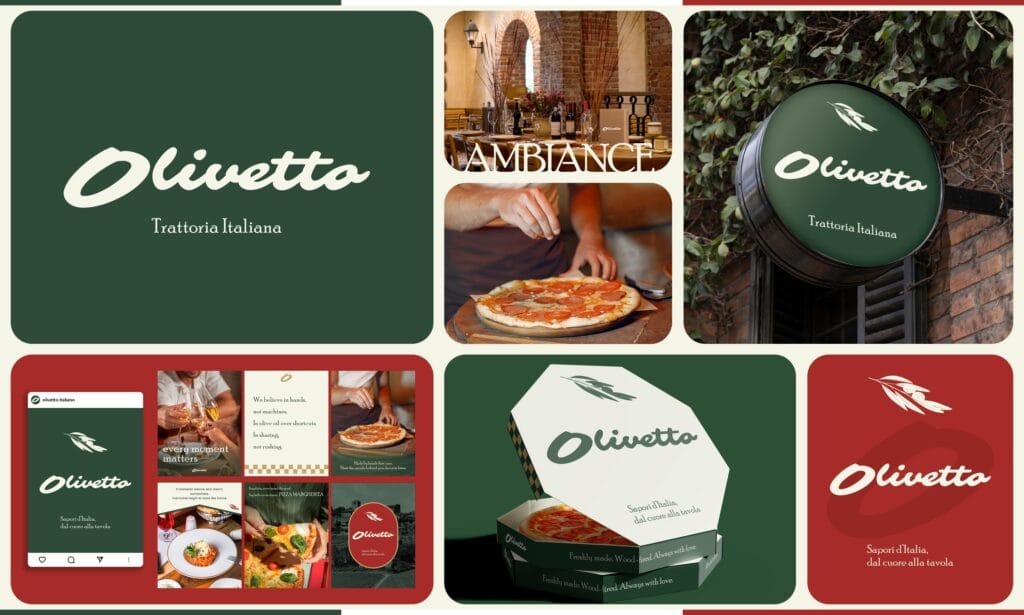
Repetition creates consistency, and consistency builds trust. As a result, your brand feels more familiar every time someone encounters it.
How to use it:
- Use the same colors, logos, and fonts across every platform.
- Keep your tone of voice consistent in all messaging.
- Build templates so layouts stay aligned over time.
Proximity: Organize with Purpose
Proximity means grouping related items together to show they belong. Consequently, your designs avoid confusion and become easier to navigate.
How to use it:
- Keep text close to its related images or icons.
- Group similar items, such as form fields or service lists.
- Add padding to separate elements that aren’t related.
White Space: Let Your Design Breathe

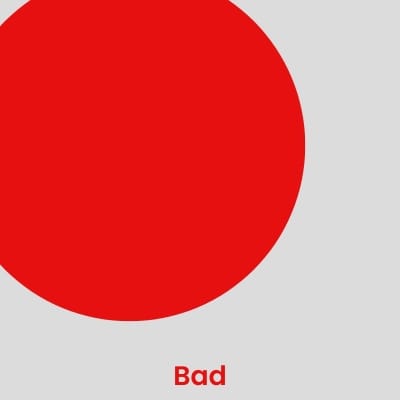
White space is the empty area between elements. It brings balance and clarity to any layout.
How to use it:
- Avoid crowding your layout. In short, less is more.
- Add padding around sections to improve focus.
- Embrace simplicity so your core message stands out.
Color Theory: Shape Emotion and Behavior
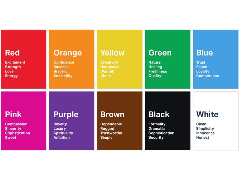
Color isn’t just visual. In fact, it’s emotional. The right palette can instantly communicate your brand’s personality.
How to use it:
- Match colors to your brand vibe:
- Playful → bright & bold (yellow, aqua, coral)
- Luxurious → rich tones (emerald, black, gold)
- Trustworthy → calm neutrals (blue, gray, white)
- Stick to 2-3 main colors plus 1-2 neutrals.
- Use color strategically to draw attention or create harmony.
Read This: Color Theory Class Every Small Business Needs
Typography: Set the Tone
Your font choices play a major role in how people perceive your brand.
Tips:
- Pick one font for headlines and another for body text.
- Prioritize legibility, especially on mobile screens.
- Remember that serif fonts feel classic and trustworthy, while sans-serif reads modern and clean.
How to Apply These Design Principles to Your Brand
You don’t need to be a designer to make visuals that feel intentional. By using these design principles step by step, you can build a brand that looks cohesive and confident.
Step 1: Define Your Brand Personality
First, get clear on who you are as a brand. This clarity sets the foundation for every visual decision that follows.
- Write down 3-5 adjectives that describe your brand (modern, playful, trustworthy).
- Think about your audience and what design language speaks to them.
- Build a mood board using Pinterest or Milanote.
✦ Design Principle Focus: Alignment with brand identity
Step 2: Choose Visual Elements That Reflect Your Brand
Next, start applying contrast, repetition, and color theory with intention.
- Choose 2-3 core brand colors and 1-2 neutral tones.
- Select fonts that are easy to read and match your tone.
- Define your image style: clean, hand-drawn, or textured, for example.
✦ Design Principle Focus: Contrast, Repetition, Color Theory, Typography
Step 3: Build Your Core Brand Assets
After that, develop visual assets that apply hierarchy and alignment consistently.
- Design a flexible logo with primary, secondary, and icon versions.
- Create marketing tools like social templates, business cards, and packaging.
- Keep spacing, font sizes, and alignment consistent everywhere.
✦ Design Principle Focus: Hierarchy, Alignment, Repetition
Step 4: Document a Brand Style Guide
A style guide isn’t just about looks. Rather, it’s your rulebook for staying consistent over time.
- Record brand colors with hex codes, fonts, and spacing rules.
- Include do’s and don’ts to prevent off-brand choices later.
- Share it with your team or any contractors you hire.
✦ Design Principle Focus: Repetition, Proximity, White Space
Step 5: Apply It Across Every Touchpoint
Finally, every customer touchpoint should reflect the same visual logic.
- Use your system on social media, your website, packaging, and ads.
- Apply proximity, alignment, and white space to keep things scannable.
- Stick to your brand rules so your business feels familiar and professional.
✦ Design Principle Focus: Proximity, Alignment, White Space, Repetition
Common Mistakes to Avoid
Even great designers slip up sometimes. Therefore, watch for these common pitfalls:
- Using too many fonts or colors. Stick to your visual system.
- Cluttered layouts. Embrace white space.
- Inconsistent branding. A style guide solves this quickly.
- Ignoring mobile design. Test every visual on a small screen first.
Final Thoughts: Design Principles That Strengthen Your Brand
Great design isn’t about being flashy. Instead, it’s about being intentional. In the end, good design makes it easier for customers to connect with your brand, trust your message, and take action.
If you’re struggling with DIY design, start with the basics: contrast, alignment, hierarchy, repetition, and color. Apply those design principles consistently, and you’ll instantly elevate how customers perceive you.
Want help getting there? Koalart Creative helps small businesses build standout brand identities using these exact design principles. Our work covers restaurants, spas, gyms, pet shops, and more, all backed by ongoing support and guidance.
You don’t need a big budget to look polished. You only need the right foundation. Even if you go the DIY route, you’re already on the right track by learning how design actually works.
Your brand deserves to stand out. Start designing like it does.




[…] Further Reading: Design Principles Every Small Business Owner Should Know […]