


What Brand Personality and Visual Identity Actually Mean
Brand personality and visual identity are the two halves of how customers recognize and feel about your business. Brand personality is the emotional tone and human character of a brand, the “vibe” people sense when they interact with you. Visual identity is the design system that brings that personality to life: your logo, colors, fonts, and imagery. Together, they decide whether a customer trusts you within the first second of seeing your business.
This matters because first impressions form almost instantly. According to Google research, users form an opinion about a brand in about 0.05 seconds, based on visuals alone. This article is written for small business owners, restaurant founders, and startups who want a brand that looks professional and feels personal, without hiring a large agency.
The Quick Answer: Why Brand Personality and Visual Identity Matter
For business owners who want the short version, here’s why these two elements are worth your attention:
- Set you apart. In a crowded market, personality is what makes you memorable instead of generic.
- Build trust fast. A consistent, polished look signals that your business is established and reliable.
- Improve recognition. When colors, fonts, and tone stay consistent, customers remember you.
- Justify higher prices. A strong brand lets you compete on value, not just cost.
- Unify your marketing. Every post, menu, and package feels like it comes from the same business.
What Is Brand Personality?
Brand personality is the set of human traits and emotional tone associated with your business. In other words, it’s how your brand would act if it were a person. It shapes everything from your color choices to the way you write captions.
To define yours, ask three simple questions. Are you fun and energetic? Sleek and professional? Wholesome and approachable? Your answers guide every design decision that follows.
3 Common Brand Personalities
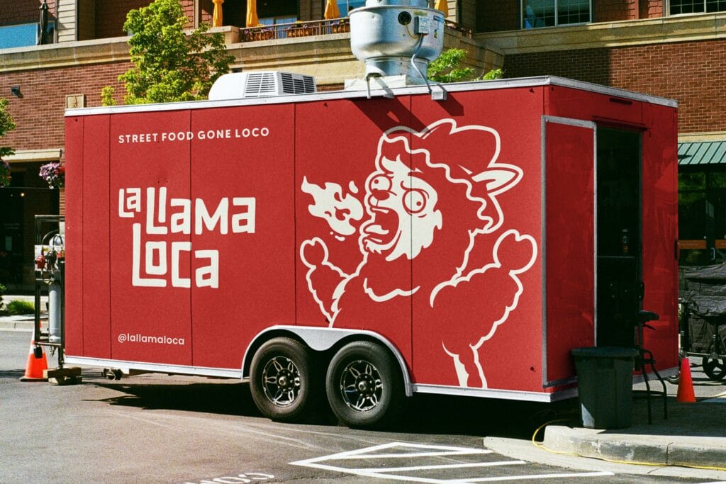
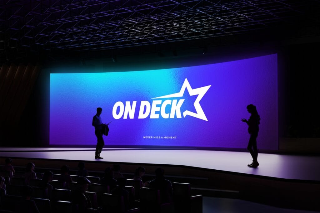
- Playful and Bold
- Bright colors
- Fun illustrations or mascots
- Conversational language
- Luxurious
- Minimalist layouts
- Monochrome palettes with gold or silver accents
- Elegant typography
- Trustworthy and Professional
- Clean, balanced design
- Classic font choices
- Calm, neutral tones
When your brand personality is clear, people know what to expect from you and they remember you for it.
What Is Visual Identity?
Visual identity is the complete design system that expresses your brand personality. It’s the toolkit every piece of your marketing draws from.
A complete visual identity usually includes:
- Logo design, logo variations and logo usage rules
- Color and typography systems
- Graphic elements like patterns, textures, and icons
- Photography and illustration style
- Layout rules for digital and print
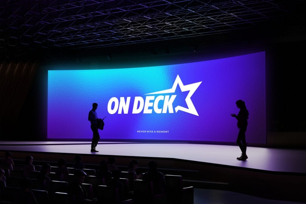
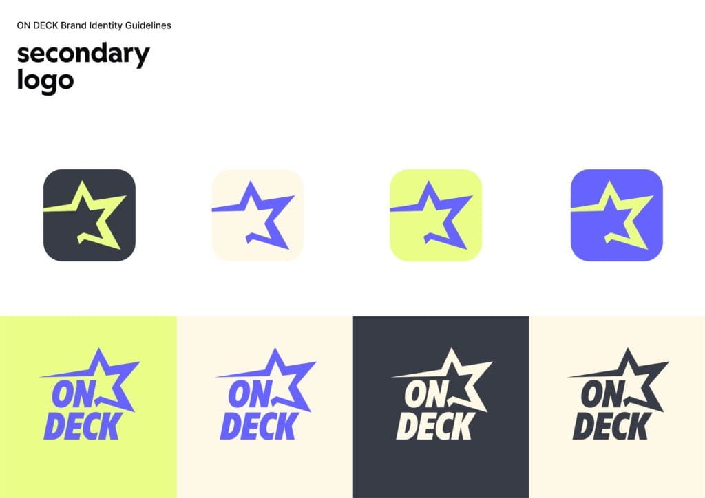
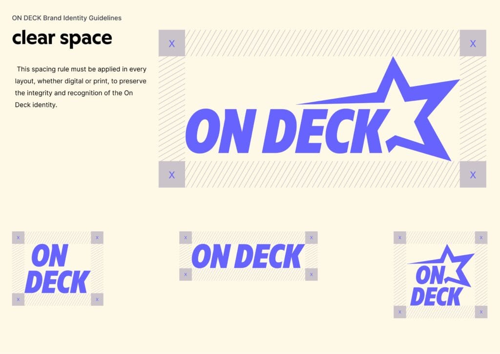
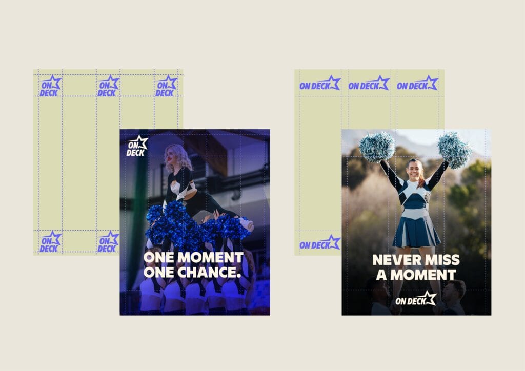
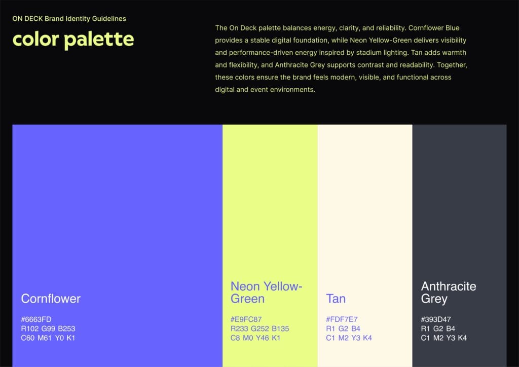
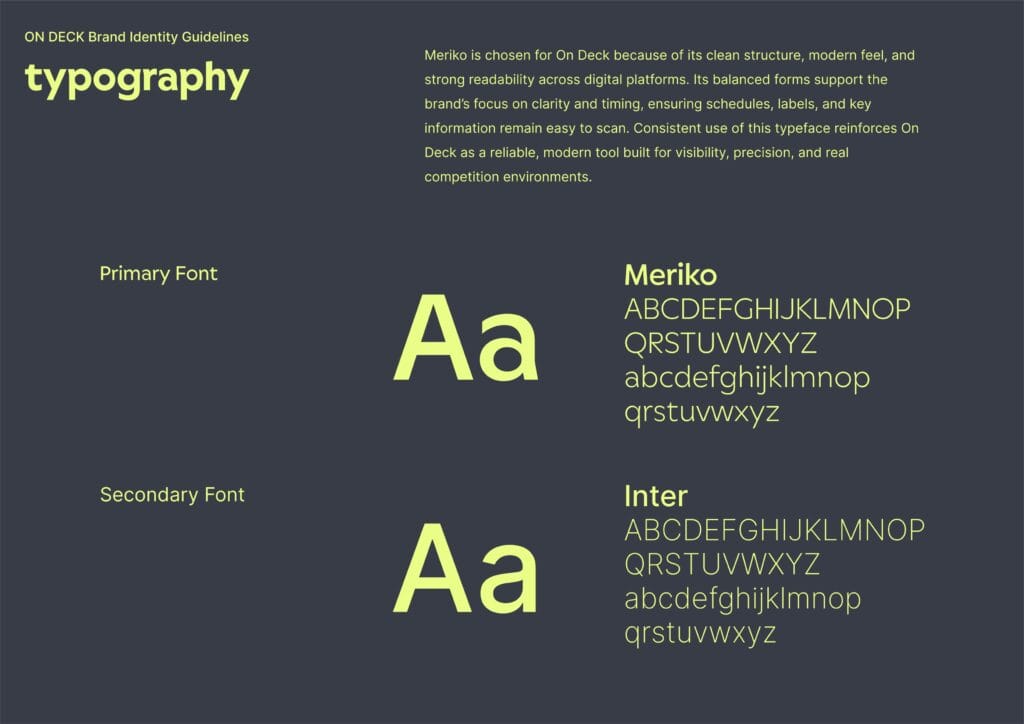
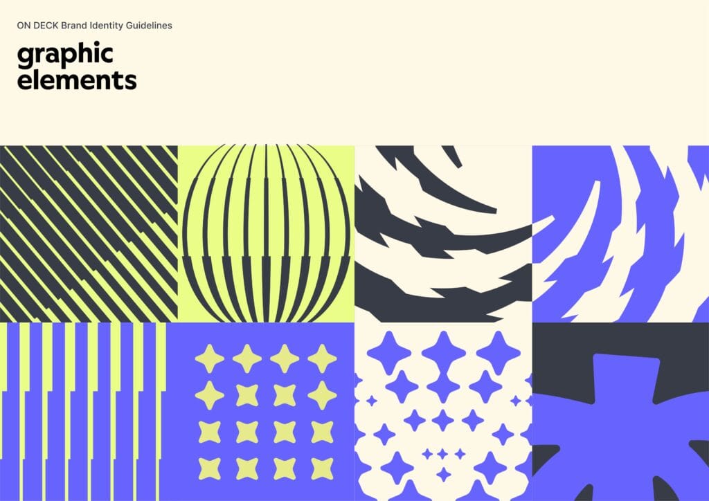
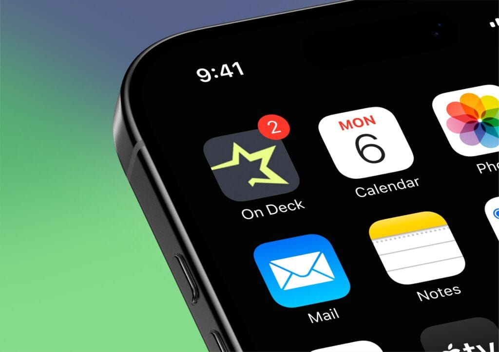
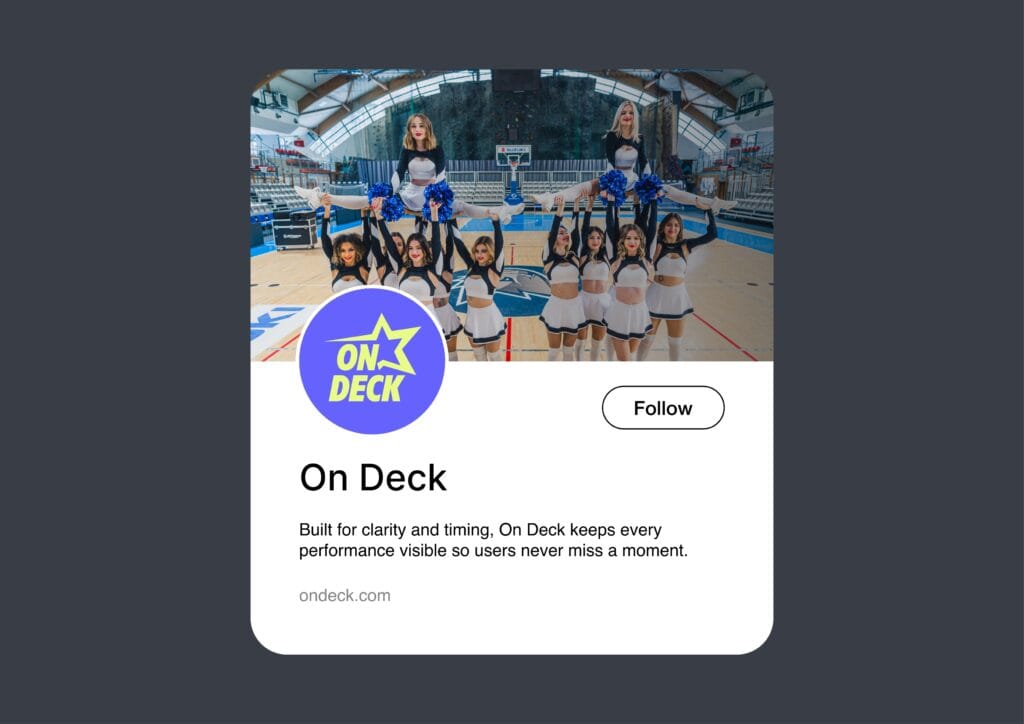
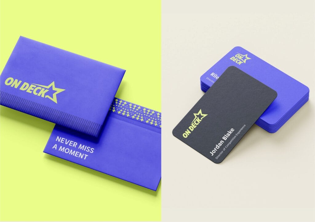
A consistent visual identity builds trust, increases recognition, and unifies your marketing across every platform. As a result, even a brand-new business can look established and credible.
Logo Rules You Shouldn’t Ignore
YYour logo is one of the most visible parts of your brand, but even a great logo loses impact when used inconsistently. Here’s a quick cheat sheet.
Do:
- Use approved versions (full color, black, and white)
- Keep clear space around the logo
- Scale it proportionally
Don’t:
- Change fonts or colors at random
- Place it on cluttered or similar-colored backgrounds
- Stretch, squish, or rotate it
A one-page style guide is enough to keep everyone aligned, from your printer to your social media manager.
Design Principles That Make Your Brand Stand Out
Good design isn’t about looking pretty. Instead, it’s about communicating clearly. These core design principles make your visuals more effective:
- Contrast: difference between elements to guide the eye to what matters.
- Alignment: keeping elements organized, especially on menus and flyers.
- Hierarchy: arranging elements by importance so people know what to look at first.
- Repetition: repeating colors and fonts to build familiarity and trust.
- Proximity: grouping related items so the layout is easy to follow.
- White space: the empty area that gives a design balance and clarity.
- Color theory: using color to communicate emotion and personality.
- Typography: choosing fonts that shape how people perceive your brand.
For example, a spa might use soft waves and pastel colors to signal calm, while a punk band might use bold angles and gritty textures.
Read this: Design Principles Every Small Business Owner Should Know
Why Consistency Is Everything
Ever seen a brand that looks totally different on Instagram vs. their website vs. their packaging? It’s Have you ever seen a brand that looks completely different on Instagram, its website, and its packaging? It’s confusing, and it quietly erodes trust.
Consistency across touchpoints makes your brand easier to recognize, reinforces your message, and looks more professional. However, consistency doesn’t mean everything has to be identical. It just needs to feel like it came from the same brand family.
Common Mistakes That Hurt Your Brand
- Random Colors or Fonts
- This dilutes your identity. Stick to your chosen palette and typography.
- Inconsistent Logo Usage
- Avoid resizing, recoloring, or reformatting your logo.
- Overcrowded Layouts
- Give your content breathing room. Clean design = premium feel.
- Ignoring Mobile Design
- Make sure your graphics and layouts work on phones. Most people will see your brand on a small screen first.
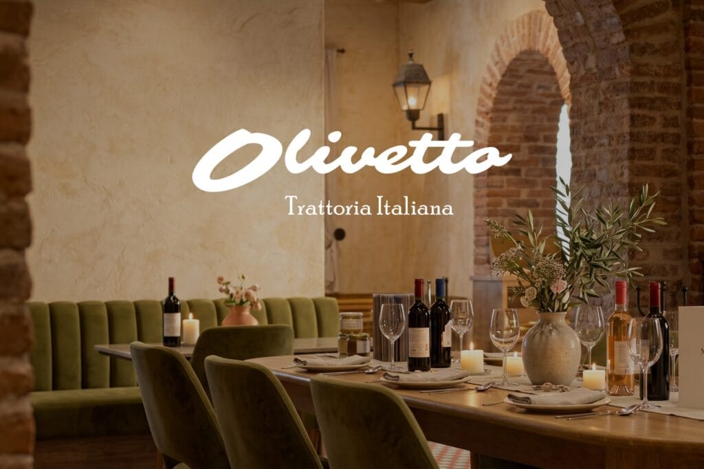
Example: Building a Brand Personality & Visual Identity for a Olivetto Ristorante
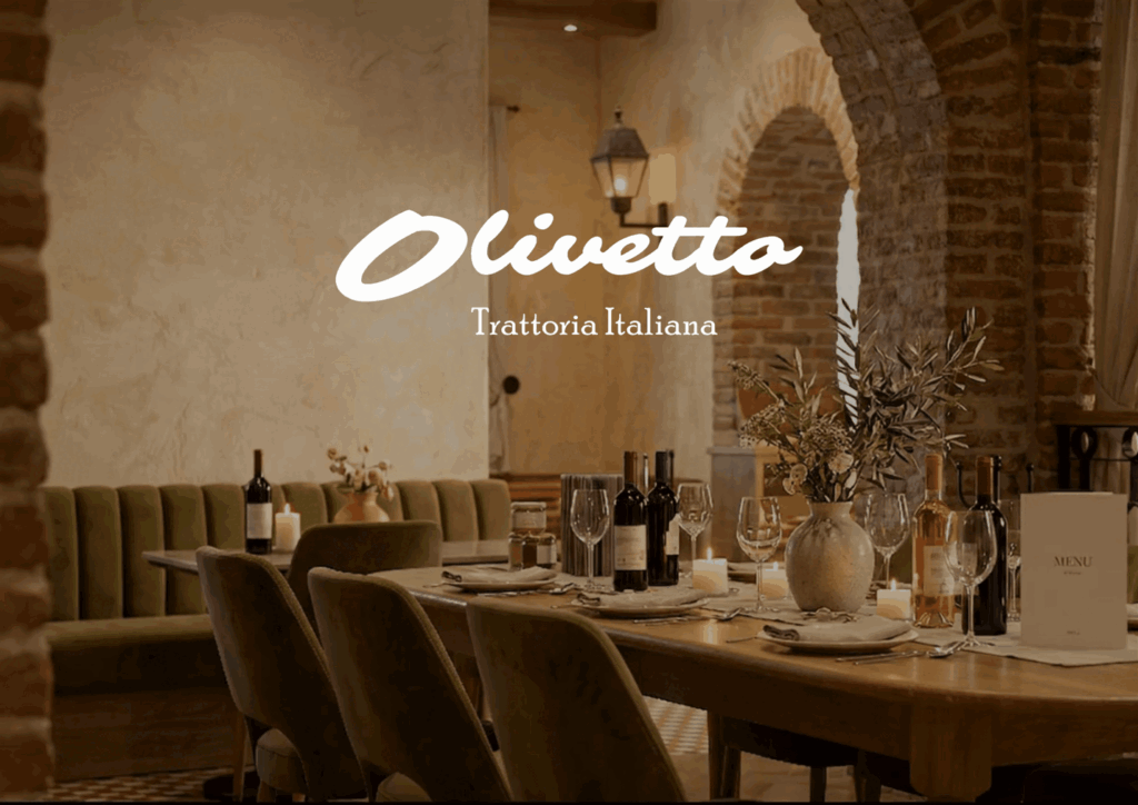
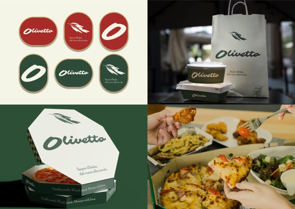
To show how this works in practice, here’s how we approached the branding for Olivetto, an Italian trattoria concept built for American diners who want authentic, unhurried meals.
Step 1: Define the Brand Personality
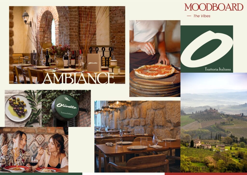
We started with five words: warm, rustic, authentic, elegant, and inviting. The audience is people tired of loud, generic restaurants, who value tradition and quality. The name “Olivetto” means little olive grove, which set the tone for everything that followed.
Step 2: Choose the Visual Elements
Next, we translated that personality into a visual system.
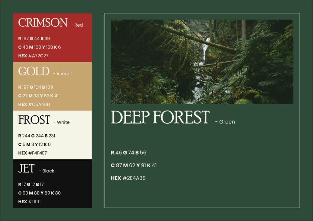
- Colors: Deep Forest green (
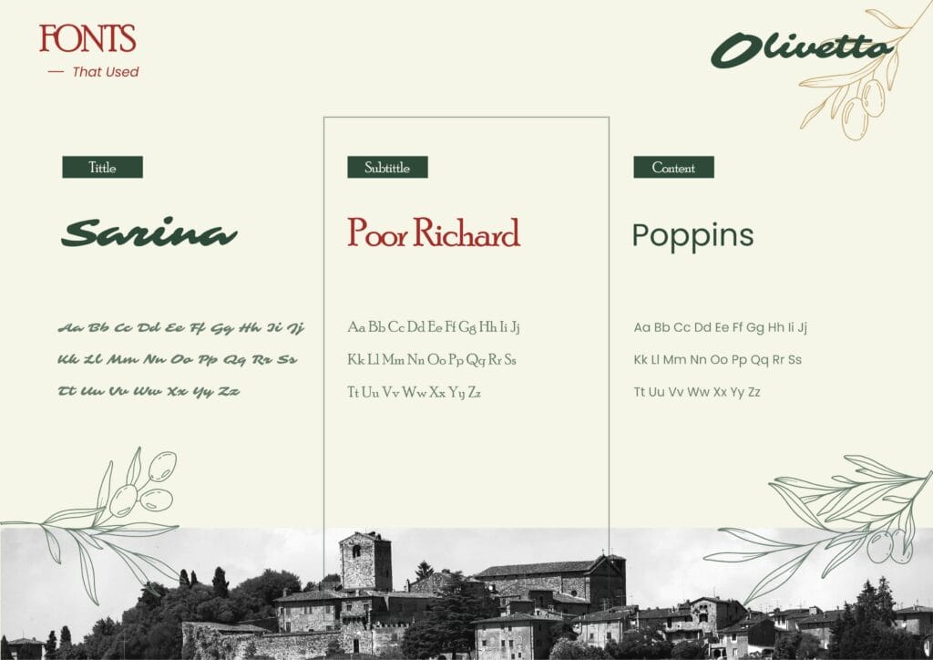
#2E4A38) as the main color, Crimson red (#A72C27) for energy, Gold (#C5A46D) as the accent, Frost (#F4F4E7) as the neutral, and Jet (#111111) for text. - Fonts: Sarina for the script logo, Poor Richard for headings, and Poppins for body text.
- Imagery: warm natural light, rustic brick and stone textures, and close-up food photography. [Also read: Color Theory Class Every Small Business Needs]
Step 3: Create the Brand Assets
With the identity set, we built the full toolkit:
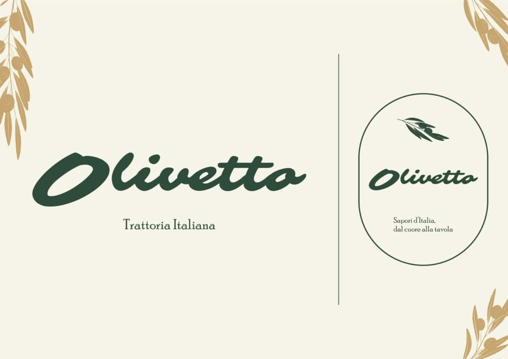
- Logo: three versions (primary wordmark, reversed, and an oval badge mark with the tagline “Sapori d’Italia, dal cuore alla tavola”).
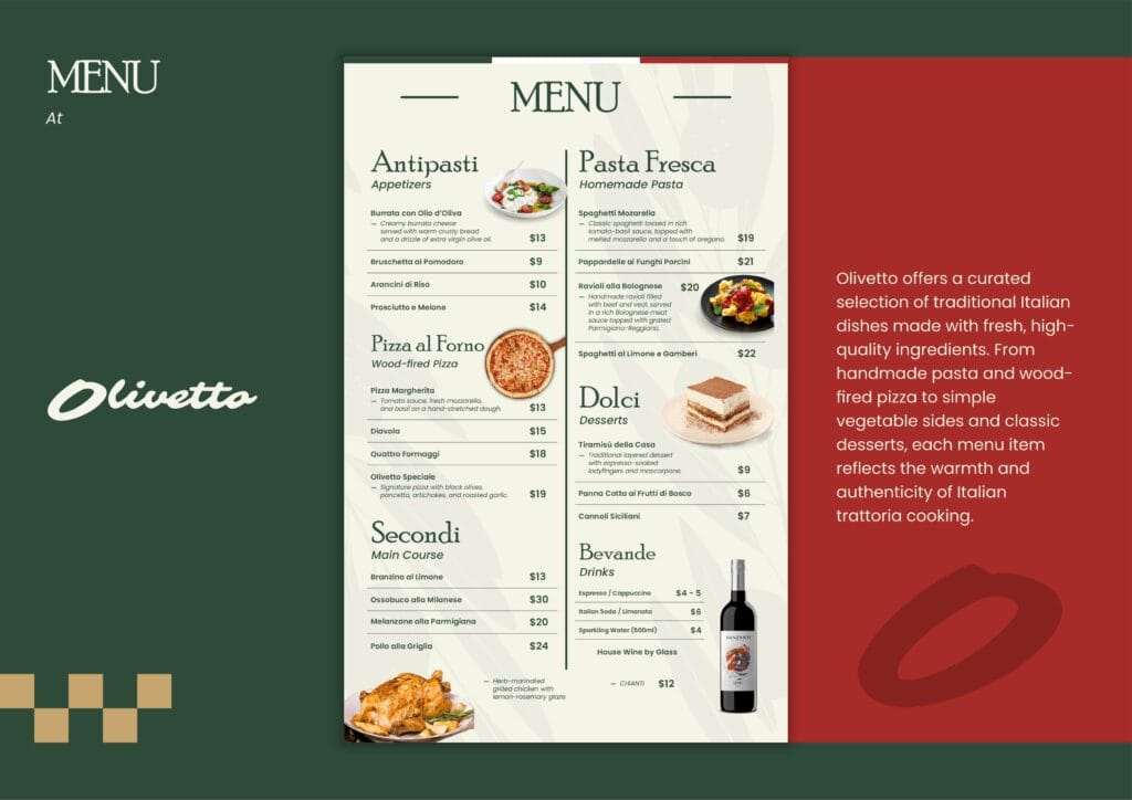
- Menu: six sections organized with the brand palette and clear hierarchy.
- Packaging: pizza box, takeaway bag, and food container, all carrying the wordmark and the gold-green checkered motif.
- Thank you card: a “Grazie” card included with every order to reinforce hospitality.
- Social templates: six formats that keep every post recognizably Olivetto.
Step 4: Build a Visual Style Guide
Then we documented everything: logo rules, color values in hex, RGB, and CMYK, typography hierarchy, and photography direction. This way, anyone working with the brand stays consistent.
Step 5: Apply It Across Every Channel
Finally, the identity rolls out everywhere: dine-in menus and signage, delivery packaging, social media, and print materials. As a result, every customer touchpoint feels like the same brand.
Results
Key Takeaways
- Consistency across channels builds trust and recognition. You don’t need a huge budget, just a clear strategy and the right support.
- Brand personality sets the emotional tone of your business.
- Visual identity is the design system that makes that personality visible and consistent.
- A logo is only one part of a complete brand identity.
FAQ
What is the difference between brand personality and visual identity?
Brand personality is the emotional tone and human character of your business, the vibe people sense when they interact with you. Visual identity is the design system that expresses that personality: your logo, colors, fonts, and imagery. One defines how your brand feels; the other makes that feeling visible.
How do I define my brand personality?
Start by writing down three to five adjectives that describe your business. Then ask whether your current visuals, colors, and tone of voice actually match those words. If they don’t, that gap is worth closing. Tools like mood boards and competitor research help clarify what direction fits your brand.
How many colors should a brand have?
Most small businesses do well with two to three main colors and one to two neutrals. More than that and the palette starts to feel inconsistent across platforms and materials.
Does visual identity really affect sales?
Yes, and consistently. Research shows that color alone increases brand recognition by up to 80 percent, and customers form a visual opinion about a brand in under a second. A polished, consistent visual identity signals credibility before a customer reads a single word, which directly influences whether they trust you enough to buy.
How Koalart Creative Helps Small Brands Look Big
Many small businesses skip branding or focus only on a logo. But customers are drawn to consistency, personality, and polish, and that’s exactly where a branding agency makes the difference.
Koalart Creative specializes in helping small businesses, restaurants, cafés, and startups build a brand identity that feels true to them and looks ready for the big leagues. Our services include logo design, brand identity, packaging design, menu design, and marketing materials.
What sets us apart:
- Experience across restaurants, wellness brands, and hospitality businessesur budget.
- Affordable packages built for small business budgets
- Free consultations and aftercare support
- Designs built around your brand’s unique personality
Read: 10 Proven Marketing Strategies for Restaurants: Ultimate Hacks



[…] Related: Brand Personality & Visual Identity: Your Secret Weapon […]
[…] Read this: Your Secret Weapon: A Branding Agency for Small Business […]