Before a customer reads your tagline or checks your reviews, they’ve already formed an opinion about you. That happens in under two seconds, driven almost entirely by what they see. This is exactly why a basic color theory class matters for small business owners: color is doing most of that work.
Research from the Institute for Color Research found that people judge a product within 90 seconds, and up to 90% of that judgment is based on color alone. (Source: CCICOLOR – Institute for Color Research, via Colorcom) A separate study from the University of Loyola, Maryland found that color increases brand recognition by up to 80%. (Source: Colorcom – Why Color Matters)
So if your brand doesn’t feel quite right, or a competitor attracts more customers with a similar product, color might be the reason. This color theory class was built for small business owners, not art students or designers.
What Color Theory Actually Is?
Most color theory classes start with the color wheel and lose everyone by the third paragraph. So let’s keep this practical.
Color theory is a set of rules that explains why certain colors feel good together, why others feel off, and why specific shades trigger specific feelings. Artists have used these rules for centuries. What’s useful for your business is that these same rules explain how customers respond to your brand visually, before they’ve consciously thought about it.
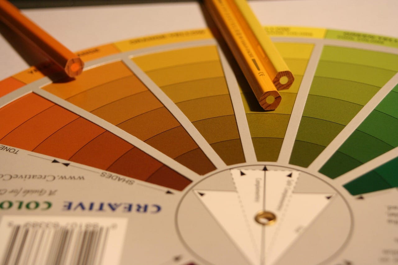
Starting with the basics: the color wheel

Colors on the wheel fall into three groups. Primary colors (red, blue, and yellow) are the originals that can’t be mixed from others. Secondary colors like orange, green, and purple come from blending two primaries. Tertiary colors sit in between: red-orange, blue-green, yellow-green. Most strong brand palettes actually live here, since these subtler shades feel less generic than a stock-standard primary blue or red.
Hue, tint, shade, and tone
These four words are often used as if they mean the same thing. They don’t. A hue is the pure color itself. Add white and you get a tint: lighter and more approachable. Add black and you get a shade, which feels deeper and more premium. Add gray and you get a tone, which reads as calm and mature.
This matters because the same base color can say completely different things depending on which direction you push it. A baby products brand using blush pink (a tint) feels soft and warm. That same pink in a muted, toned version reads as editorial and sophisticated. Same color family, totally different message.
The Psychology of Color: What Colors Actually Say
This is the section most business owners skip. It’s also the most important part of any color theory class for small business owners.
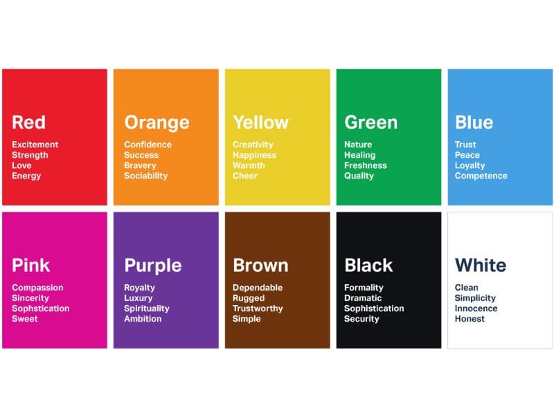
Every color carries meaning. Customers don’t consciously think “navy blue, therefore trustworthy,” but that association is running in the background every time they see your brand.
Red raises heart rate, creates urgency, and triggers appetite. That’s why it dominates fast food, clearance signs, and “buy now” buttons. Used well, it grabs attention. Used carelessly, it creates stress.
Blue is the trust color, full stop. Banks, healthcare brands, and tech companies all default to blue because it signals stability and calm. If customers need to feel confident before handing over money or personal details, blue does that work faster than any other color.
Yellow and orange both deal in energy, just differently. Yellow is almost impossible to ignore: optimistic and bright, but hard to control without a strong secondary color to anchor it. Orange is warmer and friendlier than red, carrying enthusiasm without aggression. It works especially well for brands that want to feel accessible and human.
Green has been so thoroughly claimed by wellness and sustainability brands that standing out in those spaces now requires more thought. It still works beautifully in the right context, but you’ll need a specific shade and combination to make it feel distinctly yours rather than generic.
Black and dark neutrals communicate luxury and confidence. Dark palettes feel focused and premium, which is why fashion, design, and high-end hospitality gravitate toward them. The risk is coldness; most brands that use black successfully balance it with warmth somewhere else.
Purple is genuinely underused, which makes it valuable. In a market full of blue and green, purple stands out immediately. It reads as creative, premium, and distinctive.
How to Build a Brand Color Palette That Works
Think of your brand like a team. Your color palette is the uniform. It needs to:
- Match Your Audience: Who are they? What vibe are they drawn to?
- Reflect Your Values: Are you playful or professional? Minimal or loud?
- Be Flexible: Can it work on packaging, social media, and merch?
Try this simple formula:
- Step 1: Pick one dominant color. This is your primary brand color. It should appear most often and represent your brand’s core personality. One color. Not two.
- Step 2: Add a supporting color. This appears in secondary elements like backgrounds, borders, and subheadings. It should complement the dominant without competing with it.
- Step 3: Choose a neutral. Off-white, warm gray, or charcoal. This handles backgrounds and negative space, and gives everything room to breathe.
- Step 4: Select one accent. Use it sparingly, for calls to action, highlights, and moments where you need to direct someone’s attention. It should pop without feeling out of place.
Four colors is usually enough. Brands with six, seven, or eight colors in their palette almost always look inconsistent because there are too many options and someone inevitably picks the wrong one.
One thing worth saying clearly: the biggest mistake small business owners make is choosing colors based on what they personally like rather than what their customers respond to. Your brand is a communication tool, not a self-expression project. When personal taste and customer preference don’t line up, the customer always wins.
Two free tools worth bookmarking:
- Adobe Color — build palettes based on color theory rules and test accessibility
- Coolors — lock in a color you like and generate harmonious options around it
Common Color Mistakes Small Businesses Make
- Too many colors. Four or five is a system. Seven or eight is visual noise. When customers can’t quickly read your brand, they move on, even if they couldn’t explain why.
- Inconsistency across platforms. Warm gold on Instagram, a different yellow on your business card, orange on your website. Each choice might seem fine on its own, but together they signal that nobody is really in charge of this brand. Consistency is how recognition gets built; every shift in color resets that progress.
- Poor contrast. Light gray text on a white background might look elegant on a design file, but it can be nearly unreadable on a phone screen or for someone with low vision. The W3C’s Web Content Accessibility Guidelines (WCAG) require a minimum contrast ratio of 4.5:1 for normal text. (Source: W3C – WCAG 2.1) Bad contrast doesn’t just exclude people — it also signals careless design.
- Following color trends. Trend-based palettes look fresh for about 18 months and dated for the next five years. Awareness of trends is useful; building your brand around them is not.
- Copying competitors. Knowing what colors dominate your industry is smart. Copying them exactly means blending in rather than standing out. In most markets, the most memorable brand is the one that deliberately chose something different.
A Real Example: What Happens When You Get Color Right
A local pet grooming business came to us with branding in four colors: bright red, cobalt blue, sunshine yellow, and forest green. Each one cheerful on its own. Together, they looked like a preschool classroom.
After simplifying to a calm sky blue as the main color and warm amber-orange as the accent, everything shifted. The blue carried trust and professionalism. The orange kept the brand warm and approachable. The visual clutter disappeared.
Within a month of rolling out the updated logo, social posts, and signage, bookings increased. More telling were the customer reviews: people who’d visited for years started using words like “professional” and “trustworthy.” The service hadn’t changed at all. Only the perception had.
That’s what color alignment actually does. It’s not decoration. It’s the gap between how good your business is and how good it looks.
Quick Tips to Apply Right Now
- Do a color audit: Are your colors consistent across all platforms?
- Research competitors: What color palettes are common? How can you stand out?
- Ask your audience: What feelings do your current visuals give off?
What a Color Theory Class Can Teach You About Winning Attention
Color is a business decision, not a design preference. Once you start seeing it that way, a lot of branding decisions get much clearer.
The small business owners who get their color right aren’t necessarily the ones with the biggest budgets. They’re the ones who were intentional, the ones who understood that every color they put in front of a customer is saying something, and made sure it was saying the right thing.
Color theory isn’t an art school subject. It’s one of the most practical tools available to any business owner, and this color theory class is just the beginning. The next step is applying what you’ve learned to your own brand.
Further Reading: Design Principles Every Small Business Owner Should Know
Work With Koalart Creative
Reading about color theory is one thing. Turning it into a logo, a packaging system, social templates, and marketing materials that all work together. That takes expertise.
Koalart Creative is a branding agency that works with small businesses across the United States and worldwide. Their focus is on building visual identities that are clear, strategic, and built to grow with your business.
Their services include:
- Logo Design: Marks built around your brand’s personality and market position
- Brand Identity Design: Visual systems that stay consistent across every application
- Packaging Design: Packaging that communicates value before the customer opens the box
- Social Media Design: Templates that keep your brand looking intentional and cohesive
- Marketing Materials: Print and digital materials that feel like they belong together
If your visual identity doesn’t feel like an accurate reflection of your business, that’s worth fixing. It tends to affect more than you’d expect.