


You’ve seen it before. A website, a menu, an Instagram post that looks slightly wrong, and you can’t quite say why. Nine times out of ten, that feeling comes down to one thing: alignment.
The design principle alignment is one of the most overlooked tools in branding, mostly because it works in the background. Nobody compliments good alignment directly. They just say a brand “feels clean” or “looks put together,” without realizing what’s actually doing the work.
For small business owners, this matters more than it seems. A cluttered layout or elements that don’t line up can quietly signal a lack of professionalism, even when the product behind it is excellent. Customers rarely articulate this consciously. They just feel slightly less confident, and that hesitation shows up in fewer clicks, fewer calls, fewer sales.
The good news is that fixing alignment doesn’t require design school. It just requires knowing what to look for.
Why the Design Principle Alignment Matters More Than You Think
Alignment is the invisible structure holding a design together. According to the Interaction Design Foundation, it directly shapes how people read order, relationships, and professionalism on a page or screen, even though most viewers never consciously register it.
Here’s why it matters:
- Creates a Visual Hierarchy: Proper alignment guides the viewer’s eye, helping them navigate content more intuitively.
- Builds Trust: Well-aligned designs feel cleaner and more professional, also can directly influence how much people trust your business.
- Improves Readability: Text that’s misaligned is harder to read. Consistent alignment improves the user experience.
- Boosts Brand Perception: People often judge a book by its cover. Visual consistency can elevate your perceived value instantly.
Types of Alignment You Need to Know
1. Left alignment is the default for body text, especially in Western markets, because it’s the easiest to scan.
2. Right alignment works for emphasis or contrast in small doses, but it gets harder to read in large blocks.
3. Center alignment suits headlines and short copy. For anything longer, it starts to feel unstable.
4. Justified alignment creates neat vertical edges but can introduce awkward gaps between words. Use it carefully, if at all.
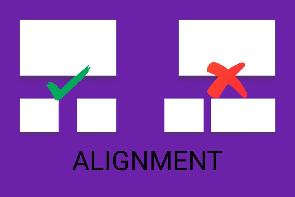
Knowing these options matters less than knowing when to use just one per section. Mixing alignment types within the same block is where most small business designs start to fall apart.
Let’s look at some everyday use cases where alignment can make a major difference
1. Website layout. If your contact form sits slightly off from your about section, visitors feel it before they can explain it. Grid systems solve this by giving every element a shared reference point, which is exactly why grid-based layout has become standard practice across professional design work.
2. Menus and flyers. Anything information-dense needs alignment to stay scannable. Column grids and consistent margins turn a wall of text into something a customer can actually read in five seconds.
3. Social media posts. Templates solve this almost automatically. Keep text, buttons, and image placement consistent across every post, and your feed starts to look intentional rather than improvised.
Common Alignment Mistakes (And How to Fix Them)
1. Floating elements, where text or images don’t connect to anything else on the page, are one of the most common issues. The fix is simple: snap everything to a grid or anchor it to a nearby element.
2. Inconsistent margins show up when spacing on one side of a block doesn’t match the other. Setting fixed padding standards across your templates solves this permanently.
3. Mixing alignment types within a single section, left-aligning some text while centering the rest, creates visual noise. Pick one alignment rule per section and stay with it.

Alignment as Part of Your Brand’s Visual Language
Brand consistency across channels helps reinforce your identity. Here’s how alignment plays into that:
1. Packaging & Stationery: Keep logo and text placement consistent on all packaging.
2. Emails & Newsletters: Use the same layout and alignment for headers, body text, and call-to-action buttons.
3. Signage & Banners: Aligned text and visuals make your signage easier to read from a distance.
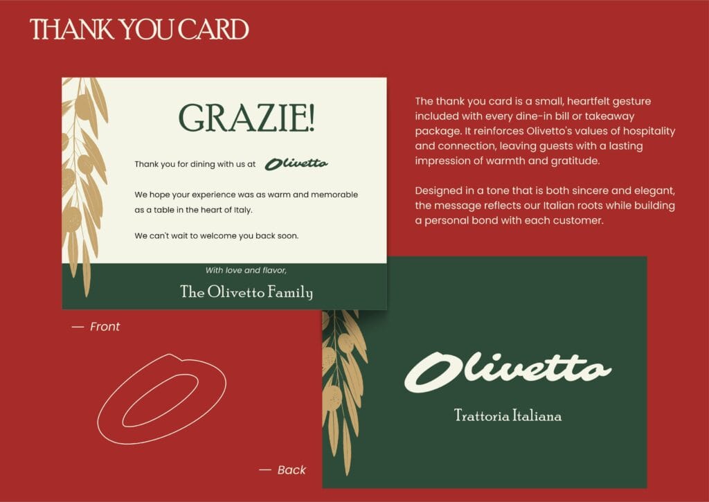
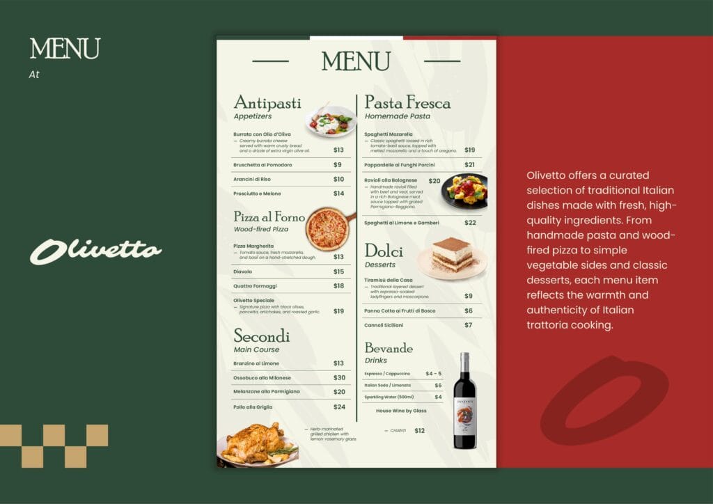
A brand that aligns its visuals consistently feels more trustworthy. Its message becomes easier to consume at a glance. And it creates a recognizable system customers come to rely on, even if they never consciously notice the grid behind it.
Koalart Creative: Helping You Align for Success
At Koalart Creative, alignment is one of the first things assessed when building a new visual identity. It’s a small detail with outsized impact, and getting it right early saves businesses from inconsistency later.
We offer:
- Custom design services with a focus on alignment and balance
- Branding kits that include consistent templates
- 24/7 support to guide you through visual consistency
Whether you’re working on your first logo or revamping your entire brand, we’re here to help you align your visuals with your business goals.
Design Principle Alignment: The Small Fix That Creates Big Impact
Alignment might seem like a minor detail, but it shapes how an audience experiences a brand from the very first glance. Applying the design principle alignment across a website, social feed, or printed material helps a business look polished and credible without changing anything about the product itself.
The shift can start today, with a handful of small adjustments. Customers will notice, even if they couldn’t name what changed.
Want help getting it right? Reach out to Koalart Creative for a consultation and see what better alignment can do for the business.



[…] Further Reading: Design Principle Alignment: Elevate Your Small Business Instantly […]
[…] Read this: Design Principle Alignment: Elevate Your Small Business Instantly […]