
Choosing a designer or branding agency is about more than finding someone who can create a good-looking logo. It is also about finding someone who understands your vision, communicates well, and can translate your ideas into a visual identity that feels right for your business.
For Aubrey and the team behind On Deck, the project started with a request for logo design and visual identity. What followed was a collaborative branding process that developed into a complete brand guideline, covering everything from typography and color specifications to supporting graphic elements.
Let’s take a closer look at our collaboration with On Deck, including the creative discussions, the development of its visual identity, and Aubrey’s genuine feedback throughout the project.
Getting to Know On Deck

Before discussing the design process, it is worth understanding the business behind the project.
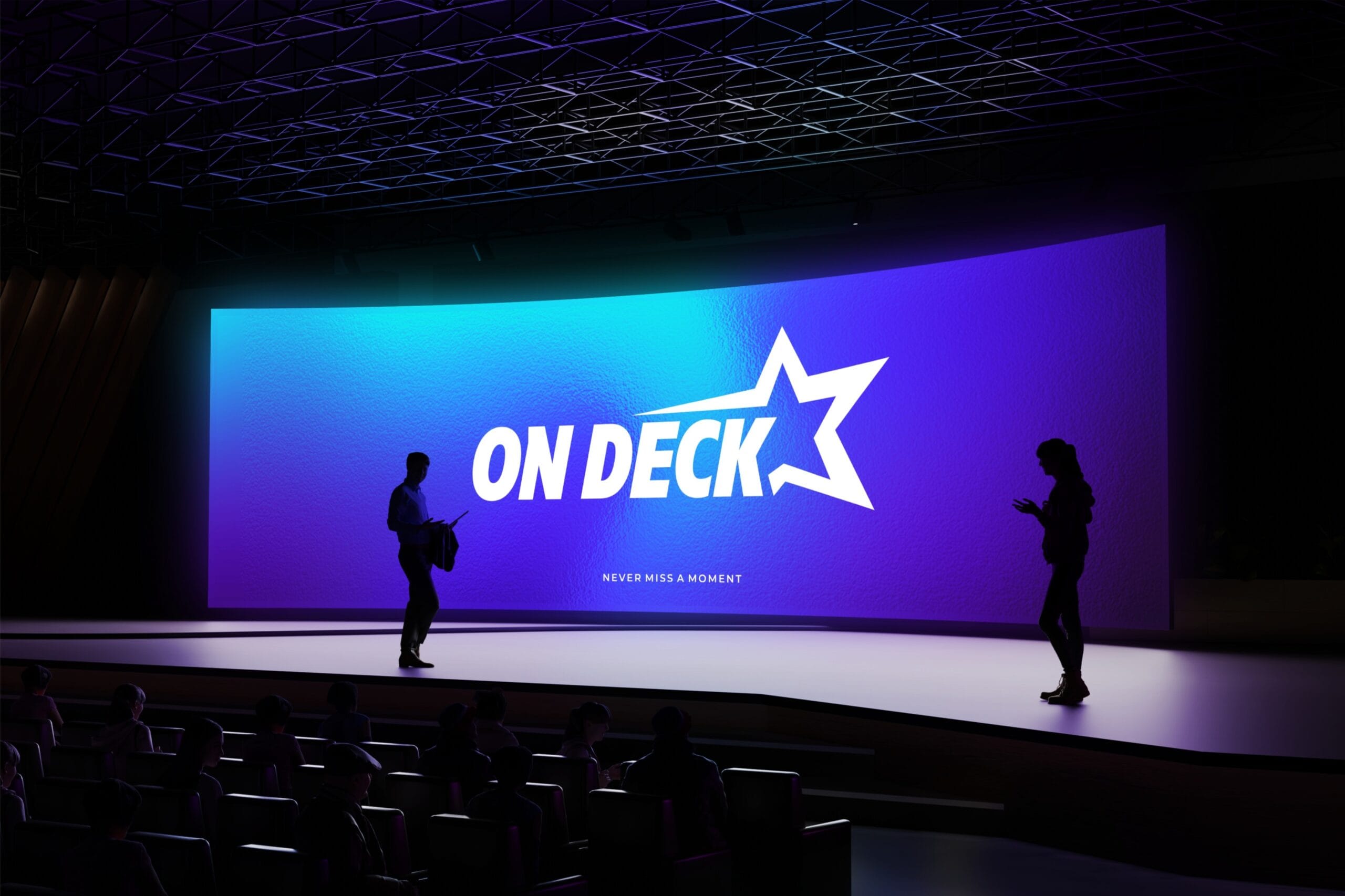
On Deck is a technology platform serving the all-star cheerleading community. Its purpose is to make competition information easier to access, helping users follow teams, check performance schedules, monitor delays, and stay updated during competition events.
For athletes’ families, supporters, and coaches, having access to clear and organized competition information can make a real difference.
This gave the branding project an interesting direction. On Deck operates at the intersection of sports and technology, two areas with distinct visual characteristics.
The brand needed to communicate the energy of competitive cheerleading while maintaining the clarity and accessibility expected from a digital platform.
Understanding this balance was an important part of developing the visual identity.
How the Collaboration Started
Our collaboration with On Deck began when Aubrey contacted Koalart Creative through our website.
The initial requirement was focused on logo design and visual identity. However, as we discussed the project and explored what the business needed, the scope gradually expanded into a more complete branding solution.
Instead of delivering only a logo and a few supporting visuals, we agreed to develop a full brand guideline that would document the visual direction and provide a consistent reference for future brand applications.
This included establishing the typography, color palette, graphic elements, and other visual specifications.
We believe this is an important distinction between simply designing a logo and developing a complete brand identity. A logo gives a business a recognizable symbol, but a brand guideline helps maintain consistency as the business grows.
Once the scope was established, we moved forward with the creative process.
A Collaborative Design Process: What Aubrey Thought About the Direction
One thing we particularly value about this project was the opportunity to discuss the creative decisions directly with the client.
Branding is rarely a process of presenting a finished design and expecting everything to be approved immediately. There are details to explore, preferences to understand, and decisions that need to be considered from the client’s perspective.
For On Deck, typography and color selection became two important parts of the discussion.
Typography: Finding a Font That Feels Right
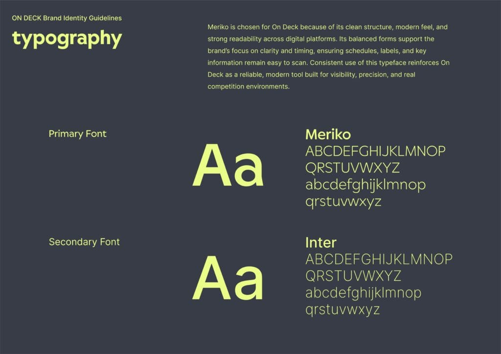
Typography contributes significantly to a brand’s personality. Even when the logo and other visual elements are already established, the choice of font can influence how the entire brand feels.
When Aubrey saw the proposed typography, the response was encouraging:
“I love the new font!”
It was a small but meaningful moment in the process. Positive feedback on an important visual element gave us confidence that the creative direction was connecting with the client’s expectations.
Color Palette: Balancing Primary Colors and Backgrounds
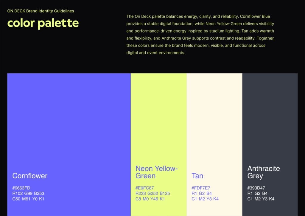
Color selection required a little more discussion.
Aubrey liked the proposed primary colors but also considered how they would look when applied to the website. The concern was whether using too much blue would make the overall appearance feel overwhelming.
Aubrey shared:
“I like the top colors as primary I think but on the website it will be too much blue right? So a tan background is better?”
This was a useful observation because a color palette should not only work in a brand presentation. It also needs to function across real applications.
A strong primary color can help establish recognition, but supporting colors and backgrounds play an equally important role in creating visual balance.
These conversations are part of how we approach branding at Koalart Creative. We value client input and consider how each visual decision will work in practice, rather than focusing solely on how attractive a design looks on its own.
What Was Included in The On Deck Project
As the project developed, our work expanded into a complete visual identity package.
The objective was to give On Deck a set of professional design assets and a clear reference for maintaining its visual consistency.
The final deliverables included:
- Logo variations: Multiple logo versions supplied in SVG and PNG formats.
- Editable logo files: Adobe Illustrator source files (.AI).
- Brand guideline: A PDF document outlining the visual identity system.
- Color specifications: The brand’s defined color palette.
- Typography: Font selections and typographic specifications.
- Graphic elements: Supporting visual assets supplied in SVG format.
- Additional brand specifications: Visual identity references and usage details included in the guideline.
Providing editable source files was also an important part of the delivery. It gives the business more flexibility when working on future marketing materials or additional brand applications.
Rather than leaving the client with a logo that can only be used in a few predefined formats, we wanted to provide a practical collection of assets that could support the brand beyond the initial project.


Client’s Final Feedback: “It Looks So Good”
For us, one of the most rewarding parts of a design project is seeing the client’s reaction when everything starts coming together.
After the design discussions and development process, Aubrey shared a message regarding the work that had been sent:
“I’m so sorry I missed this message everything is great here is what you sent in beta :)”
The response was followed by two short messages:
“It looks so good”
“Thank you!”
These messages were a lovely way to wrap up the collaboration.
What makes this feedback particularly meaningful is the context behind it. The project involved actual conversations about typography, color preferences, and how the visual identity would work across different applications.
For us, client satisfaction is not simply about receiving approval on a final design. It is also about making sure that clients feel comfortable sharing their thoughts throughout the process and that their input is considered along the way.
We appreciate Aubrey’s trust in Koalart Creative and the opportunity to contribute to On Deck’s brand development.
More Than a Logo: Building a Brand That Can Grow
Looking back at the project, On Deck is a good example of how a focused design request can develop into a more comprehensive branding solution.
What started with logo design and visual identity became a complete brand guideline, giving the business a more structured visual foundation.
From the typography and color palette to the supporting graphic elements, each part was developed with the overall brand direction in mind.
It also reflects something we consistently believe at Koalart Creative: branding should be a collaborative process. A designer brings creative expertise and visual direction, but understanding the client’s perspective is just as important in producing a result that feels appropriate for the business.
Whether you are launching a startup, developing a digital product, or looking to establish a more professional brand identity, having the right visual foundation can make a meaningful difference. At Koalart Creative, we help businesses turn their ideas into cohesive brand identities through thoughtful logo design, visual identity development, brand guidelines, and marketing materials.
Why Choose Koalart Creative as Your Branding Agency?
Because we don’t just design, we care.
Our team of creatives, available 24/7, works with you to:
- Tailored for Small Businesses.
- Affordable, Premium Quality.
- Offer revisions and support until you’re 100% satisfied.
- We Store Editable Files for 6 Months, always accesible.
- Fast Turnaround, Always Reliable
We’ve helped countless small businesses go from invisible to irresistible.