
How a Chicago-based marketing agency refined its brand identity
Choosing a designer or branding agency is about more than finding someone who can create a good-looking logo. It’s also about finding someone who understands your business, listens to your ideas, communicates clearly, and can turn your expectations into something practical.
For businesses looking to improve their visual identity, the experience behind the project matters just as much as the final design.
That’s why we believe sharing genuine client experiences is important. It gives potential clients a better understanding of what working with a design agency actually looks like, beyond polished portfolio images and promotional claims.
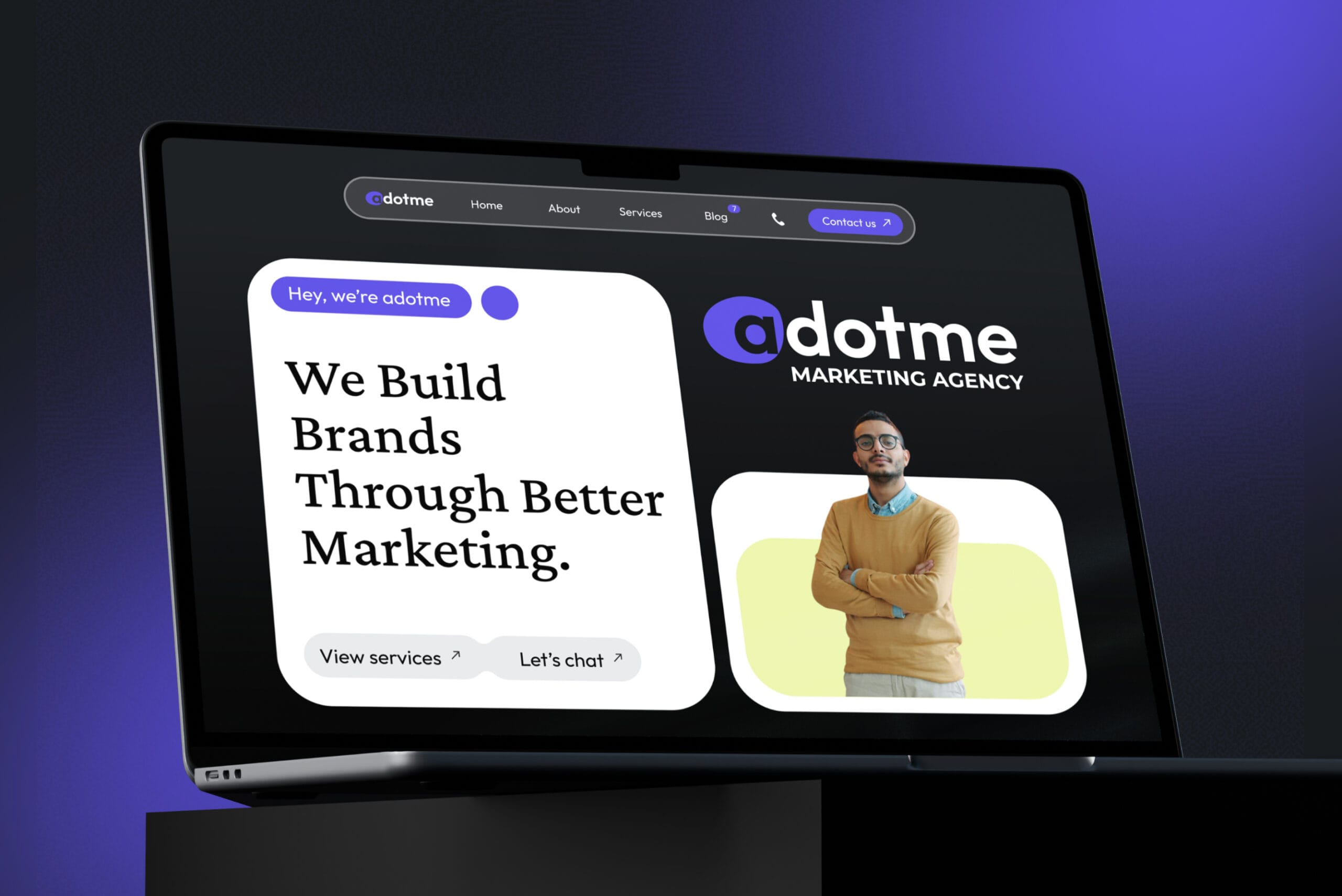
One of our projects that reflects this approach is our collaboration with Adotme, a marketing agency based in Chicago, Illinois.
Adotme approached Koalart Creative to refine its existing brand identity and develop a more structured visual system. The project involved improving several elements of its branding and bringing them together into a cohesive Brand Style Guide that could support the agency’s future marketing activities.
But this story is not just about the design deliverables. It’s also about the collaboration, the conversations behind the project, and the experience of working together.
How Adotme Found Koalart Creative
Our collaboration with Adotme started through Reddit, where the client discovered Koalart Creative and reached out about their branding requirements.
The conversation continued through WhatsApp, giving us an opportunity to discuss the project in more detail, understand the client’s expectations, and identify what needed to be improved.
At the beginning of a branding project, we don’t like to jump straight into designing. Every business has its own personality, objectives, and preferences. Understanding these details helps us make better creative decisions rather than simply producing something that looks attractive.
Adotme already had an established visual identity. The objective wasn’t to replace everything or create an entirely different brand. Instead, the agency wanted to bring its existing elements together in a more consistent and organized way.
This distinction helped us establish the direction of the project from the beginning.
We agreed to focus on developing a comprehensive Brand Style Guide, including logo refinements, typography, color palette, supporting graphic elements, and practical guidelines for using the brand across different platforms.
Having a clear understanding of the requirements before starting the design work helped keep the project focused and gave both sides a shared direction.
Understanding What the Client Needed

Adotme operates in the digital marketing industry, where visual communication plays an important role in how an agency presents itself.
Its brand identity needed to reflect a modern and creative personality while maintaining a professional appearance. More importantly, the visual elements needed to work together across different applications, from social media graphics and presentations to website materials and other marketing content.
During the project, we focused on several key areas:
- Logo system: Refining the existing logo and organizing its variations for more consistent use.
- Color palette: Establishing primary and supporting colors that work naturally together.
- Typography: Creating a clear typographic hierarchy for different types of communication.
- Supporting graphics: Developing additional visual elements to strengthen brand recognition.
- Brand guidelines: Bringing the entire visual system together in a practical reference document.
Rather than treating these as separate design tasks, we approached them as interconnected parts of one brand identity.
The goal was to give Adotme a visual system that would be easier to apply and maintain as its marketing activities developed.erves your time.inkedIn, while families may respond better to Facebook ads or community group posts.
The Branding Process: From Existing Identity to a Consistent Visual System

Once we had agreed on the project scope, we moved into the design development stage.
One of the main considerations was preserving the recognizable character of Adotme while making its visual identity more organized. A refinement project requires a different approach from creating a brand from scratch. You need to understand what is already there, identify what can be improved, and make sure the changes still feel connected to the original brand.
Bringing Everything Together in a Brand Style Guide
After developing the individual visual components, we brought everything together in a comprehensive Brand Style Guide.
The document covered logo variations, color combinations, typography, supporting graphic elements, and practical brand usage examples.
We also prepared the logo assets in editable and export-ready formats, including AI, SVG, and PNG.
A brand guide should be useful beyond the initial design project. It needs to give the business a reference that can be used when creating new materials, working with other designers, or expanding its marketing activities.
For Adotme, this meant having a more organized visual foundation that could support its ongoing communication needs.
An Honest Client Review: What Working Together Looked Like
A portfolio can show the final design, but it cannot always explain what the working relationship was like.
Was communication comfortable? Did the designer understand the brief? Was the process clear? Did the final direction reflect what the client wanted?
These are questions that matter when someone is considering hiring a branding designer.
At Koalart Creative, we value honest client feedback because it offers a perspective that we cannot provide ourselves. We can explain our process and show our work, but the client’s experience belongs to the client.
For the Adotme project, we want to give that experience its own space rather than burying it beneath a list of design deliverables.
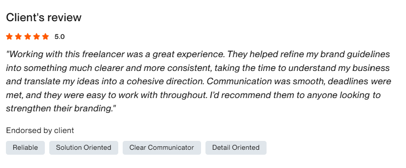
“Working with this freelancer was a great experience. They helped refine…”
“Thank you so much, I really appreciate all the hard work.…”

We believe client reviews should remain genuine. That means keeping the client’s original message intact rather than rewriting it into a marketing statement or adding compliments they never made.
For anyone considering working with Koalart Creative, this feedback provides another perspective on the collaboration behind the finished project.
More Than a Finished Design: Why Client Experience Matters

A successful branding project involves more than delivering files at the end of the process.
It requires a shared understanding of the brief, realistic expectations, clear communication, and attention to the details that matter to the business.
Every client comes with different requirements. Some need a completely new identity, while others already have a logo and simply want to make their branding more consistent. The approach should reflect those differences.
That’s why we take time to understand the project before deciding on a creative direction.
We also believe that good collaboration should leave room for discussion. Design is a creative process, and sometimes the first direction needs adjustments before it becomes the right solution.
Our role is not simply to produce designs based on a checklist. It’s to understand what the client is trying to achieve and translate those requirements into visual solutions that make sense for the brand.
The Adotme project is one example of how this approach can be applied to an existing brand identity.m logo and menu design through to packaging and social templates that keep everything consistent.a.
Why Brand Consistency Matters for Marketing Agencies
For a marketing agency, having a consistent visual identity is particularly important.
Agencies help other businesses communicate their messages, build recognition, and connect with their audiences. Their own branding should reflect the same attention to detail.
Without clear brand guidelines, visual materials can gradually become inconsistent. Different designers or team members may interpret the logo, colors, and typography differently, resulting in a disconnected brand presentation.
A professional Brand Style Guide helps prevent this by providing a shared visual reference.
It establishes how the logo should be used, which colors represent the brand, how typography should be applied, and how supporting graphic elements contribute to the overall identity.
As marketing activities expand, these guidelines become even more useful. They help maintain consistency across websites, social media, presentations, advertising materials, and other brand touchpoints.
For growing businesses and agencies, brand consistency isn’t simply about making everything look the same. It’s about creating a recognizable visual experience wherever people encounter the brand.
Looking for a Branding Partner for Your Business?
The Adotme project reflects an important part of our approach at Koalart Creative: understanding the business, listening to the client, and developing visual identities with practical applications in mind.
We work with startups, entrepreneurs, marketing agencies, and small businesses looking for professional branding solutions without the unnecessarily high costs often associated with traditional design agencies.
Whether you’re starting a new business or refining an existing identity, we’re happy to discuss your ideas and explore how we can help.
Your brand deserves more than just a good-looking logo. It deserves an identity that communicates clearly and works consistently.
Have a project in mind? Visit Koalart Creative and let’s talk about your branding needs.
Explore Adotme: Official Website – adotme.co